Wednesday, May 30, 2012

Two for One Option


Just to forewarn every one, I am very sorry for how many pictures there are, there are quite a bit of pictures and that is why the post looks so long, but it really is not that long. Hope you all enjoy the pictures, they are all my own photographs, manipulations, and drawings. Also any words written are my own, I do not believe I have any famous quotes in there, they should all be ones that I alone though of and wrote down. ~Dani G


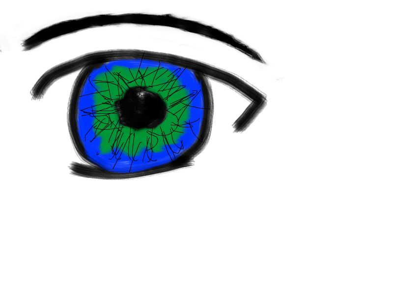
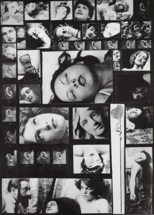
 Though I am not an amazing artist, I still consider myself a new artist that is exploring different types of media, from computer art and photography to drawing and painting. Now, before I took this art history class (my first one) I never really observed artists or anything of that matter, I mean I knew some of the paintings, who they were done, by and what they were called, but never really knew anything else. So I don't really know what artist really influences me, because its mostly poetry and stories that influence my drawings. I mean some works of art that I can say influenced me or that I can see my art/ doodles/ and drawings tying into are the photos I manipulated. Those manipulated pictures of mine can maybe be referenced to Andy Warhol, because of how his Marilyn Monroe picture looked. Also, my photos can be referenced to Barbara Kruger because in her photo Untitled (Your Gaze Hits the Side of My Face) she has words in her photo, like I do in mine. I know that some of my drawings are not the most famous kind of drawings within the artistic world; like anime: many of my drawings are anime inspired. In reality I am believe I fit in with the artistic times of now, contemporary art. Though my art is not "cutting edge" like Andy Warhol, or "risky and different" like Roy Lichtenstein, it is still contemporary in the form it takes.


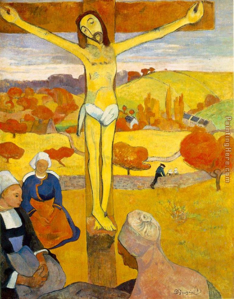
In all honesty, I mostly enjoyed learning about contemporary art, like Chihuly, and post modern artists like Van Gogh. The contemporary period draws me because that is the time I live in, so in tern it is the period i gotta compete against when I try to get my art out in the world. I also like the post impressionism period because  it was very different. Vincent Van Gogh  created very different works of art in displaying the sky, buildings, the night, and night life. Van Gogh's  The Starry Night captures my interest with how the brush strokes are and the colors used to explain the landscape underneath the moon and stars. Nineteenth century artist James Abbott McNeill Whistler was very intriguing to say. His art piece Nocturne in Black and Gold, the Falling Rocket almost looks like a simplistic painting until closely looked at. Once looked at you can almost see what appears to sparks coming down from the sky (like a rocket). This is very interesting to see that this painting can be brought to life by the texture that is shown and the changes in color that is shown.

To say it all, I very much enjoyed this class and the learning environment provided. This was the best online class I have taken, and I thank you my peers, and you my professor, for making it a very welcoming class where I can learn new things, as well as other people's opinion and thoughts.

Good luck to everyone on the final and on future endeavors! Hopefully I will see someone's name in a museum one day :)

~Dani G.


Wednesday, May 23, 2012

Roy Lichtenstein

Look Mickey- 1961
According to Google, pop art is " art based on modern popular culture and mass media." Roy Lichtenstein was well known for his "pop art" and his main focus was on comic books and how the images within the comic books were displayed. The two figures, Donald Duck and Mickey Mouse, were both major icons in America. Look Mickey was "inspired by a bubble gun wrapper Lichtenstein's son had given Lichtenstein was around thirty-seven." Look Mickey was also brought to life when "Lichtenstein wanted a place in the forefront of mainstream art, and win [that place] with something radically different." By using  Benday Dots, Lichtenstein created a piece that looks like it was simply painted on to the canvas. However according to Google, Benday Dots are " part of the printing process, that is similar to pointillism." Unlike comic books Lichtenstein's dots were very close together giving the artwork a cleaner look. Where as in comic books, the dots were a little bigger and were able to be seen.

In all honesty, Roy Lichtenstein is an inspirational man. By realizing the original artwork he was doing was going unnoticed, he radically changed his art in order to be noticed. With his artwork Look Mickey he did just that; get noticed. Taking a risk by using Benday dots as well as two popular Disney characters, created a work that would not be missed.

Comic Books, like books, evoke emotion because of what the reader/ viewer is looking at and witnessing, while reading what is being said. Going along with that, the picture above does the same thing; evoke feeling. Now, this picture might not be played out to see what happens next to the famous Donald Duck, but it still brings in a little giggle or two because of how it is depicted.

Lichtenstein was very nervous about how Look Mickey would be perceived by audiences and so he himself chuckled at the artwork. I mean who cannot relate to that, I can, when I am nervous, I try to laugh off the insecurities of what I am nervous about.

Trying to be radically different is very risky, especially when using two family/ children icons is very testing on the emotions. However, Roy Lichtenstein made a great leap of faith.


Source:
http://www.jstor.org.ezp.lib.cwu.edu/stable/3109436?seq=6&Search=yes&searchText=Look&searchText=Mickey&list=show&searchUri=%2Faction%2FdoBasicSearch%3FQuery%3D%2528ca%253ALook%2BAND%2Bca%253AMickey%2529%26gw%3Djcp%26acc%3Don%26prq%3D%2528ca%253ALook%2BOR%2Bca%253AMickey%2529%26Search%3DSearch%26hp%3D25%26wc%3Don&prevSearch=&item=5&ttl=5&returnArticleService=showFullText&resultsServiceName=null

Wednesday, May 16, 2012

Dada and the Surrealism of New Life

Hannah Hoch: Cut With The DADA Kitchen Knife Through The Last Weimar Beer-Belly Cultural Epoch in Germany: 1919
Once the Great War had started, it left a destructive path in the European area. Many artists and poets left to escape the destruction the war was creating, and in turn started a new artistic movement because of the war; Dada. Dada was essentially "created to address the slaughter and moral question of war" (Stockstad 1037) as well as "mocked the senselessness of rational though and even the foundations of modern society because of how thoughtlessly life was discarded in the trenches" (Stockstad 1037). Dada was also the "apparent collapse of bourgeois cultural values (a collapse displayed by the barbarism and destruction of war" (Powerpoint Lecture 8). However, with the Dada movement started a  new era of art. This art mocked and ridiculed other art as well as society and government, no topic was off limits. In the image above, Dadaist Hannah Hoch was very active with the "women's movement." Hoch was also the one female amongst the primarily male Berlin Dada group. Her artwork took words and images for other magazines, posters, and photos in order to convey a message. This message was an angry message that criticized society and government for not seeing women for their real potential and instead seeing women "as merely conjuring up beer and sandwiches" (Stockstand 1039).

In all honesty this is art, just a very different almost abstract for of art. The images the compose her art work show guns, and a very depressing state of work conditions and life and display words like "die" within it. This is art because this type of art, Dada, was composed of mocking how society saw things. Her collage incorporates an angry tone that is easily conveyed, yet the pictures all show different images, leaving the viewer to see the full picture of what Hoch was angry about. In many pictures on the collage their are female bodies, but they are portrayed with a males face. This shows a degrading demeanor for men, and also shows society that women can men can be the same, though they do not look it.

Salvador Dali, The Phenomenon of Ecstasy, 14 December 1933
 Surrealism is the "dissent from and critique of the stabilized bourgeois order (and values) in the 1920s and 1930s" (PowerPoint Lecture 8). In Salvador Dali's art piece, he composes his art of images based primarily on a sexual nature. By doing this, he went against what bourgeois values were. This almost pornographic looking artwork shows people in a sexual nature, including the ears. In turn, this image created a basically behind the scenes of life. Though their are images of ears and sculptures, they still produce a seductive look at the image. A value of bourgeois was that private life was indeed private, however to depict essentially some one's private life disbanded the values that were once upheld.

Honestly, the image to many could be repulsive and offending because it essentially shows the sexual life of man. Though, during this time one's sexual side was very private, and it is understandable how many could be offended and maybe embarrassed by seeing Dali's art work. Though in today's society, people are more comfortable when seeing sexual images, since it is displayed in all medias, so seeing this image was okay for me. However, times have changes and in the 20s and 30s people were more conservative about their sexuality and what they did and looked like in the bedroom.


Wednesday, May 2, 2012

The Pollock Formula


 Upon looking at the picture "The Yellow Christ" one can see that it is very different from a tradition painting of the crucifixion. The difference between the pictures is that the one shown above strays away from traditional and instead is Avant-Garde.  To analyze how "The Yellow Christ" is in fact Avant-Garde, this blog post will examine the three criterion of Griselda Pollock's formula.

The three criterion of Pollock's formula (shown on page 167 of The Challenge of Avant-Garde are:
  1. reference: "one had to produce work that showed an awareness of what was already going on,"
  2. deference: "defer to the latest and most radical developments," and
  3. difference: "be involved in establishing difference that had to be both legible in terms of current aesthetics and criticism, and a definite advance on the current position."
While examining the first criteria for Pollock's formula, it can be established that "The Yellow Christ" follows it. Gauguin's piece resembles part of what Avant-Garde was, impressionistic. The painting is close to a monochromatic background (despite the sky) which makes the background less noticeable, and helps draw attention to the foreground. Also, throughout the whole canvas their is not definitive detail in terms of eyes or the leaves on trees. The brushstrokes are more, almost to say, sketchy. However, the main focal point of the piece is Christ on the cross. In scale he is larger compared to the women that are around him. This is what many impressionists, or Avant-Garde pieces focused on, thus showing that the painting above follows the first criteria of Pollock's formula.

As for the second criteria of the formula, "The Yellow Christ" follows the most recent movement of impressionism. Though the brushstrokes aren't as controlled they are still not detailed and smooth. As well, impressionists used certain color schemes to evoke emotional responses of the pieces, or to even symbolize emotional responses. Withing the painting "The Yellow Christ" the colors are more like the colors of fall season. As well, the sky is not bright and illuminating, but instead it is almost portrayed like the sun is setting. Using the colors of fall (of dying) and of the sun setting (darkness), it sets a dismal mood for the painting. As for the foreground, the faces of the women and of Christs are not joyful but saddened, showing that it is a saddened moment in the painting. With how the painting was done, it Gauguin followed the second criteria in Pollock's formula.

Now, the last criteria of Pollock's formula. Gauguin's painting was very different which is what Pollock's third criteria required. Gauguin, depicted a natural everyday setting however, he evoked the religious ties to that setting creating an emotional response by the viewer. By combining the beauty of the background as well as a religious icon he created the aesthetics of the painting. Painting this evoked a spiritual tie and response to Christ being crucified, as well as evoked a saddened feeling because (though the background was beautiful) it signified death, which was then portrayed by Christ on the Cross.

By figuring out the Gauguin's painting followed Pollock's formula we are conclude that Gauguin's painting is Avant-Garde, and very well done.

Wednesday, April 25, 2012

The Isolation of Modern Society


    After looking over Caillebotte's art, I personally believe that his art has made me evaluate what I see the most.  In many of his pictures (shown below) there is a clear point of isolation. Now Isolation can be a subject or a point within a picture that is singled out from the rest of the art, or it can mean just what many people feel in society, alone. In many of his paintings he displays both kinds of isolation. In the first two pictures one can see couples everywhere, but then there is one lonely single person in the picture (whether foreground or background). His paintings show a modern society, because he paints according to the times; modernity. However, his paintings also depict the nature of modern society; couples and singles. Caillebotte's paintings also seem more like a critique of how modern life was. These pictures all seem to have a great outlook on each picture because of the composition of it. However, in the same bright happy composition is shadows and isolation within which brings a gloomy feel to the painting.  Why is isolation seeming to be a key in Caillebotte's paintings? In all honesty I believe it is because that is how modern society became and that is what Caillebotte wanted to show. Society was no longer a close knit people but separate and some isolated by the rest of society. This shows almost a class division as well in the first picture. The couple to the left look like they are in nicer clothing then the isolated person in more warn clothing on the right side. This man is isolated in a few ways, 1. he looks like a lower class then the people to the left, 2. he is looking beyond the bridge,3. he stands alone over the railing of the bridge, and 4. he is standing in the shadows giving his a sadder feeling then everyone else.
    In the last picture one sees how everyone is alone in the painting. Yet, one thing that is isolated almost on the top center of the painting is a couple walking together. This displays a hopeful cheery outlook when the mood seems to be gloomy because everyone is alone. Caillebotte's  painting can create a different mood that is opposite of the initial mood when looking at the full painting. What Caillebotte is doing is almost like isolating the emotions the viewer feels about the one difference in the picture compared to the picture as a whole. Caillebotte used isolation mixed with modern society to show a diffrernt outlook on how society has become and looks. By doing this his painting created emotions by looking at the full picture, but also by lookg at what was isolated within the picture. Now I might not be fully covering what we talked about in class, but this is my in depth look at how Caillebotte's art works is comprised of isolation and modernity. 

Wednesday, April 18, 2012

Forgetful or Not.. Impressions stay with you forever ..

In all honesty, Impressionism is far from forgetful.  Impressionism is the technique of showing the world or anything in a different way. Impressionists art was not clearly defined by lines, nor were the art pieces free of brush stroke lines. In fact Impressionists went against what the Academy taught and instead focused on shedding a different kind of light on what people saw. The art during the Impressionism era was created with a lack of clear definition of detail, as well as colors that blended with each other compatibly even if they were completely different colors. Doing this sometimes the artist would highlight the foreground by making whatever was in the foreground 3-D and the background flat looking.

By the Sea by Renoir
Monet and Renoir were two Impressionists during the time. they were "rejected for not painting bloodied corpses in ruined boulevards" (p 121). However, in today's time both Monet and Renoir are very famous for their works of art because there art was different and went against the norms of how art was in that day and age. Impressionism is far from "forgetful" in relation to artistic technique and tradition. I mean yes, Impressionism was not the typical way to create art. Yet, Impressionism created a new way to display are and create art and be able to get across a message. In a way though Impressionism was not clearly defined by detail or lines and definition, sometimes when looking deeper into a painting one will notice little clues to what a painting could be about, and that is a way Impressionism leaves an everlasting mark.

Renoir's painting (shown above) depicts a woman by the sea. However, like Impressionist paintings, the background is flattened behind the foreground. The colors as well in the background have been blended together and look almost like a backdrop behind the woman. As for the woman in the foreground, one can see that there are still no set lines within her figure or the chair leaving very little definition besides the colors that compose her. This was how Impressionist paintings were. And just like that, looking into her eyes and at how the woman and the almost backdrop looking background, one could see what the painting means, and therefore the painting could leave an impression on them.

Starry Night by Vincent Van Gogh
With  color Impressionism takes a lead in standing out and being remembered. Typical paintings displayed what the artist saw and tried to accurately recreate the piece that the artist is focusing on. However, with Impressionism he color could be skewed in a way to depict a certain mood or even a message. The art work for impressionism could be seen as more symbolic with how colors were made to make a mark on the viewer. Say the painting that you were looking at is the one above. The colors and brightness of the landscape is beautiful and gives off a happier feeling, like one is content with life. Though the larger figure in front is dark and somewhat chaos looking, it is the sky and the brightness that can pull the viewer away from the chaos and bring the viewer to feel content.

Though Impressionism was rejected by many, it still stood strong. Impressionism i a type of art that could not, can not, and will not be forgotten because it paved a way for what art could become. The art was meant to leave an impression on the viewer when looking at the painting. That is way it will not be forgotten because every person that has seen an Impressionist painting, that painting has left an impression  on them never letting them forget it.


Wednesday, April 11, 2012

Impressionism Stance

Claude Monet, Impression: Sunrise, 1872

      Impressionists were unlike those were were scholars in painting and art. Impressionists manipulated their work to depict anything they wanted. Sometimes the art showed something in the foreground in 3-D and the background in 2-D. Sometimes, the art was all in 2-D so the picture can be fully seen as is. Sometimes, even, colors and shapes would blend together so they could make a complete picture. Claude Monet's painting, Impressionism: Sunrise, was part of what many Impressionists used to create their art. Meaning Claude Monet's painting went against what academic painters were taught which was a cleaner non abstract type of art work.  Monet's painting (shown above) shows a variety of blues and greens to depict the shadows and the water during sunrise, as well as the paintings color enhancement with the vibrant color of the sun, the sun's reflection, and the sky. Contrary to what many people said about the painting only being a sketch and "not finished" (Art History, 986), this painting creates a full fledged scenery that one can put together but looking at the shapes and colors, as well as the whole scene of the painting.
        The painting is made complete with the use of different, yet cohesive colors like oranges, yellows, whites, greens, and blues to create a "fog over the harbor" (Art History, 986). With the colors, many parts of the painting are shown and more focused on. As the colors of the harbor and the fog blend together, the colors of the sun and the rising colors give a focal point for what the viewer should look at first when trying to understand the image. The sun radiates the color orange which also gives it a focal point since that orange color is isolate and surrounded by blue colors. Then showing the vibrant colors of the sky gives the viewers a feel of the sun rays, as it is rising, reflecting off of the clouds. It is with these two starting points the it can be clearly seen that the painting is a sunrise. Then looking at the blues and greens of city line and the water, it can be thought that this is a harbor during the early morning. With Monet's choice of color he brought his viewers to look deeper into the colors to see the painting that laid before them.
       The next part of the composition that brings this painting to life is the shapes that are painted. Though the city line (the harbor) is faded with the color, it can still be distinguished by the shapes. In the painting, smoke and chimneys, and boats can all be recognized because of the shape that is most recognizable, and how that shape has a darkness in the color. So even when looking at the painting and trying to figure out what is being shown, the viewer can distinguish smoke, and the outline of maybe factories, and boats. Another part is the shapes are not painted in depth, meaning they are painted in 2-D and not 3-D.Using all 2-D objects within the painting means that the viewer with not bypass the picture as a whole and instead focus on the meaning of the object that is in 3-D because it is different. Having the painting this way make is so objects within the painting do not stand out more then others, and that the painting is seen in its entirety.
       Monet's painting has a haze type look of the painting because no clear definitions of faces, or objects can be seen in the painting. Doing this makes the viewer really look at the painting to see what comprises it and makes the painting whole and gives it meaning. Monet was an Impressionist, even the title of the painting above is Impression: Sunrise. the painting was entitled that because this painting makes an impression on those who truly look at the painting and not just glance at it. This painting contributed and was part of redefining what art really was and what it could be. Art is really in the eyes of the beholder, and though many artistic things do not appeal to many, Monet's do. With Monet's use of color and shapes to make the complete picture, his "foggy" appearance leaves all viewers really looking into the painting and to what that painting possibly means to them.


-Dani G